With our new brand identity, Mizzen Education is geared up to offer you more—more community-building events, more capacity-building experiences, and more leading-edge lessons on everything from art, journalism, rocketry, robotics, and bees, to STEM, youth entrepreneurship, and language literacy.
While our mission remains rock solid and our trusted platform continues to provide thousands of vetted resources at no cost, get ready for a whole new chapter of empowering education and endless possibilities!


Designed with community input, our new logo is both modern (future-oriented), and a little old-school (rooted in our core values).
Our name, Mizzen (pronounced miz-uhn), symbolizes our commitment to working "at the middle," connecting educators with content, quality with equity, and passion with innovation.
The Zs at the center of our logo make space for a dotted bridge. It stands for Mizzen’s role as a connector that builds community and closes gaps—and for the continuous journey of learning itself.
Four dots represent our core values. We strive to be: human-centered, purpose-driven, collaborative, and creative.


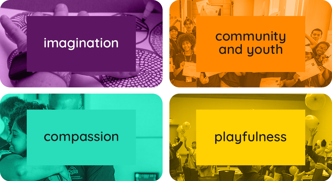
Our new color story strives to be as alive as the ingenuity of the out-of-school time field. We believe in the power of partnership, ingenuity, inclusion, and spreading joy. That’s why we’ve adopted a color palette that’s:
- Purple: for inspiration, imagination, and wisdom
- Orange: for energy, youth, and community
- Yellow: for spontaneity, playfulness, and fun
- Turquoise: for communication, compassion, and clarity
Designed for readability, we use contrast ratios of at least 4:5:1.
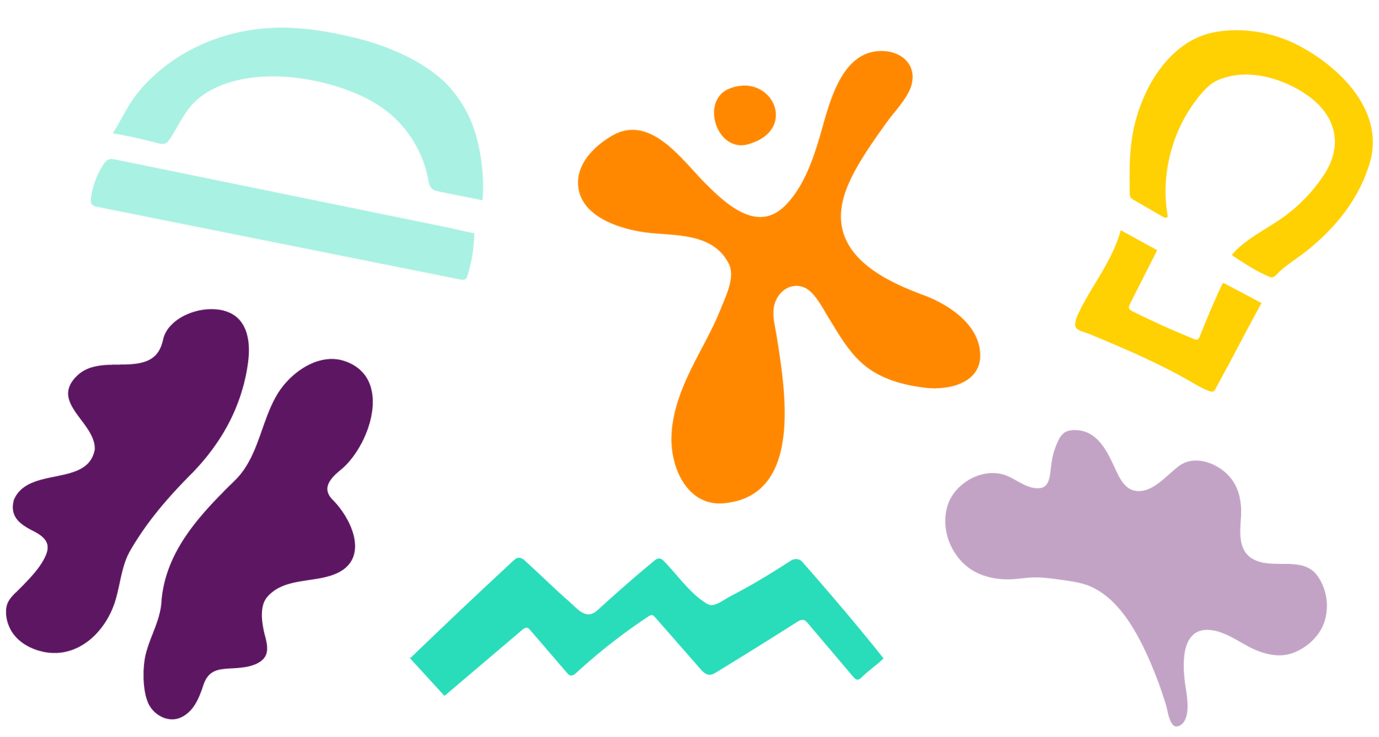
Is that a butterfly or a brain? At first blush, the shapes surrounding our new brand may seem random, but they hold meaning.
From freeform shapes to unswerving lines, you can count on Mizzen to blend creativity and play with clarity and structure.
Our new patterns and shapes symbolize our passion for community, reliability, joy, and adventure.

Join a community of more than 16,000 out-of-school time professionals who are teaming up with Mizzen Education to transform learning.
With your free account, you’ll access over 1,600 activities that expand capacity, inspire creativity, and open new worlds of discovery.
Mizzen Education isn't just a platform; it's an opportunity to connect, share, and learn with like-minded professionals who are passionate about out-of-school time education.


